Design Principles
01 -Anything in Photoshop

1. Used the fill tool to make the background black. 2. Used the shape tool to make a circle and used the granite tool to make the circle a shaded blue.
02 -Design Principle Mock-ups

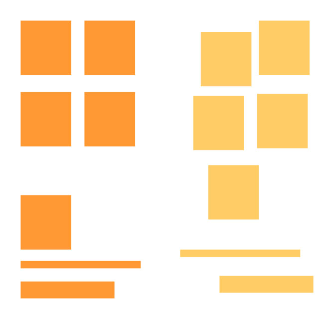
I used the shape tool and clicked on the rectangle, making sections with small spaces on the page. Then I started making a small example of all the principles.
03 -Balance

I used the fill tool and filled half of the page, making it black. Then I used the shape tool, using the circle and filling it in with white. For the white section, I made the circle again but used black to make it balanced, sort of like the yin-yang.
04 -Alignment

I basically repeated it, using the same squares and made them neat to make it alligned.
05 -Repitition

I used reptition, basically what the title of this principle is. I made them all the same and spaced them out evenly, as if they were a pattern.
06 -Contrast

I tried to make it zebra like. i used the shape tool to make the circle have black lines against the white circle.
07 -Space

I basically made a space in the middle, seperating the two shapes.
08 -Proxmitity

I used different shapes and sizes, then spaced them out that way they are contrast.
09 -Refined

This used to be just an image before I added 'JOIN SKILLS USA TODAY"
10 -Animated Gif
